- Which project was your favorite or most successful this semester? Please explain.
- Regardless of whether you liked or disliked a project, which one did you learn, grow, or developed the most from? Please explain.
- Choose 1 piece of Art that you used skills and techniques learned from previous projects. Discuss your growth as an artist and how you incorporated these skills and techniques to create the piece.
- Choose a piece or artwork where the subject matter or theme reflects you as an artist. One that you have a personal connection to. Please explain your choice.
- Can you offer any additional feedback on this course?
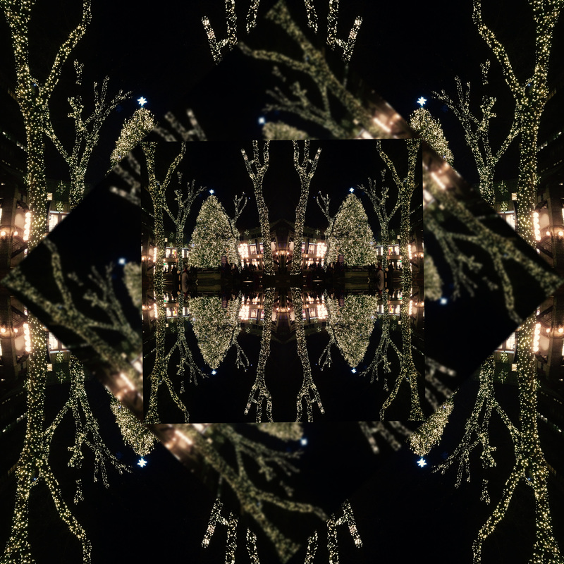
- My most successful project this semester was the light painting. I learned a lot from it and it was so much fun. I learned all about exposure. I had a lot of trial and error but it was an enjoyable process. We had to redraw the pictures many times to try and make them look better. I loved how they came out so that was a positive too.
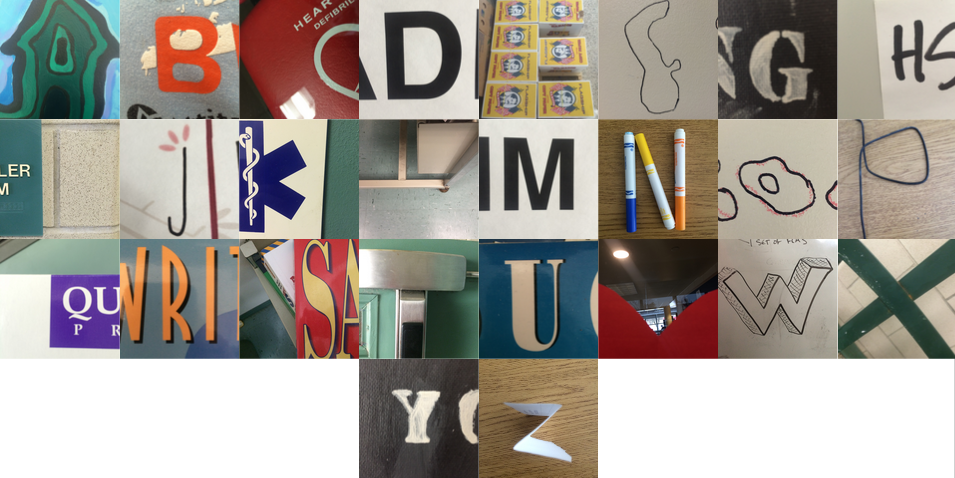
- I think I grew a lot from the alphabet project. It doesn't seem that complicated but it actually took a lot of work. Everyone was taking pictures all over the school and I didn't want to take the same exact pictures that everyone else had. I had to do the project over the course of a few days. It took a lot of imagining and trying to picture things differently. Putting it all together was such a relief because of how long it took.
- The 12 Days of Photoshop built off of what I did in Art Design and New Media. I learned a lot of basic photoshop skills then. I loved the project because I got to brush up on old skills and do better than I had my freshman year. I was still able to erase the background. I was also able to use the selection tool. Using the clone stamp proved to be more difficult because I hadn't really used it in the past. There wasn't really much more that I learned skill wise, but my artwork looked cleaner than it did last year.
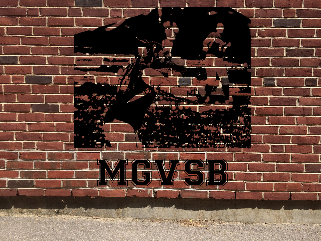
- I have a personal connection with my street art picture. I took a picture of a brick wall and put a picture in of me playing softball that someone else took. I had to try other pictures but they weren't really coming out. Trying to mess around with the picture to make it show up on the wall was tough but it worked. I went on dafont.com and downloaded "Varsity" by Broderbund Software. I put in "MGVSB" which stands for Millis Girls Varsity Softball. I loved it because I love softball and I loved how it turned out.
- The only feedback I have is that the gradient portrait was my least favorite project. I didn't feel it really benefited me. It took up so much time and we could've spent it doing something else. I don't think actually learning about gradients is invaluable, but I think a different project might have worked better.
 RSS Feed
